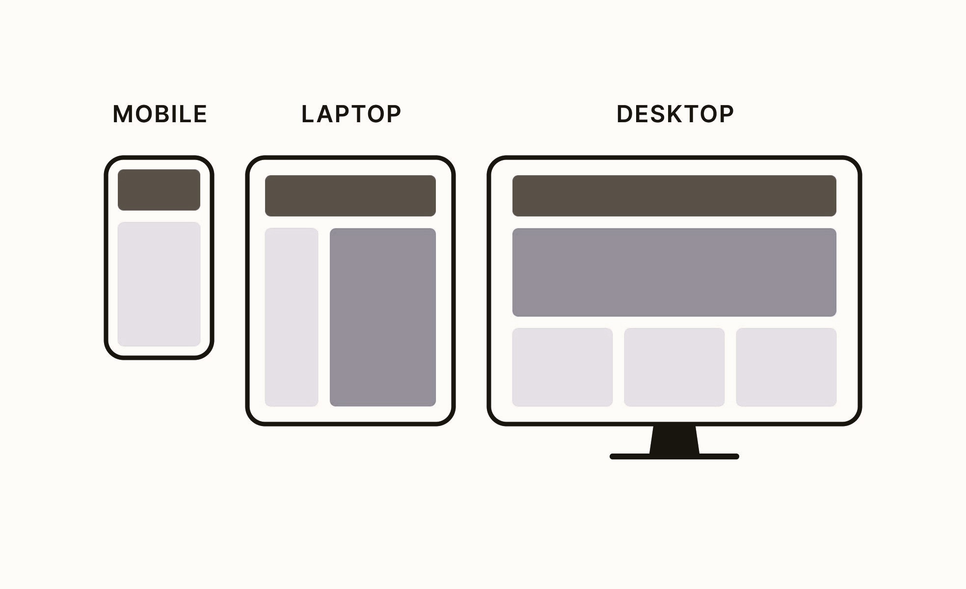
In the rapidly evolving landscape of technology, where new devices and platforms constantly emerge, the concept of adaptive design has become essential for ensuring a seamless and consistent user experience. Adaptive design involves creating digital interfaces that can flexibly adjust to various devices, screen sizes, and user preferences. This article will explore the principles of adaptive design, its significance in the face of technological evolution, and the role of standards in guiding its implementation.
Understanding Adaptive Design
Adaptive design is a user-centric approach to web and application development that aims to deliver an optimal user experience across a diverse range of devices and screen sizes. The key objective is to provide users with a consistent and user-friendly interface, irrespective of whether they are accessing content from a desktop computer, tablet, smartphone, or other devices.
Key Components of Adaptive Design:

- Flexible Layouts: Adaptive design uses flexible grid systems and layouts that can adapt to different screen sizes and resolutions. This ensures that the content is presented in an organized and visually appealing manner across various devices.
- Media Queries: Media queries are CSS techniques that allow developers to apply different styles to a webpage based on the characteristics of the device, such as screen width, height, or orientation. This enables the adaptation of design elements to match the capabilities of the user’s device.
- Responsive Images: Adaptive design incorporates responsive image techniques to ensure that images are appropriately sized and optimized for different devices. This helps in minimizing page load times and improving overall performance.
- Progressive Enhancement: Progressive enhancement is a philosophy within adaptive design that involves starting with a basic, universally accessible version of a website or application and progressively enhancing it with additional features for more capable devices. You can read more about the merging of artificial intelligence and design in our article.
Significance of Adaptive Design in Technological Evolution
- Proliferation of Devices: The technological landscape is characterized by an ever-increasing variety of devices, ranging from traditional desktops and laptops to tablets, smartphones, wearables, and smart TVs. Adaptive design allows content to adapt to the unique specifications of each device.
- Diverse Screen Sizes and Resolutions: With the multitude of devices available, designers face the challenge of accommodating various screen sizes and resolutions. Adaptive design ensures that the interface remains visually appealing and functional regardless of the device’s display characteristics.
- User Expectations: Users today expect a consistent and seamless experience when interacting with digital content across different devices. Adaptive design meets these expectations by providing a unified and user-friendly interface, irrespective of the device being used.
- Technological Advances: As technology advances, new features and capabilities are introduced. Adaptive design allows for the incorporation of these advancements while ensuring that the user experience remains cohesive and efficient.
The Role of Standards in Adaptive Design
Adhering to established standards is crucial for the successful implementation of adaptive design principles. The World Wide Web Consortium (W3C) is a key player in setting standards for web technologies, including those related to adaptive design.
One of the prominent standards is the W3C’s Responsive Web Design (RWD) specification. This specification outlines the principles of creating responsive and adaptive web designs that provide an optimal viewing experience across a wide range of devices. Designers and developers can refer to these standards to ensure that their adaptive designs meet industry-recognized criteria.
Case Studies in Successful Adaptive Design

- BBC News (Wikipedia – BBC News): The BBC News website is an exemplary case of adaptive design. It seamlessly adjusts its layout and content presentation to cater to various devices, providing a consistent and user-friendly news consumption experience.
- Google (IGN – Google Wiki): Google’s search interface is designed with adaptability in mind. Whether accessed on a desktop computer, tablet, or smartphone, Google’s search results page adjusts its layout to accommodate the device’s screen size, ensuring an optimized user experience.
- Etsy (Fandom – Etsy Wiki): Etsy, an e-commerce platform, employs adaptive design to create a responsive shopping experience. Users can browse and make purchases comfortably across different devices, with the interface adjusting to suit the screen size and capabilities.
Conclusion
Adaptive design stands as a critical approach in addressing the challenges posed by the ever-evolving technological landscape. As users engage with digital content across an array of devices, adaptive design ensures a consistent, visually appealing, and user-friendly experience. By adhering to established standards, designers and developers contribute to the creation of digital interfaces that stand the test of technological evolution, meeting the expectations of today’s diverse and tech-savvy users.
For further insights into adaptive design standards, visit the World Wide Web Consortium (W3C) website: W3C – Responsive Web Design.


